Visual Designer & Photographer
Project: Apple Music - Social Bar & Improved Recommendations
My Roles: UI, user research, visual design, competitor research, wireframing, prototyping, copy
Tools Used: Figma, Photoshop, Illustrator
The Team: Self Started Project
Date: June 2021
Setting the stage
Music is and always has been a big part of my life, it's my favourite artistic medium and a day doesn't go by that I don't listen to and look for new content. I'm constantly exploring this mysterious, mind-blowing form of human expression.
Given this passion, I decided to embark on a personal project - part of which was done as a student project for Juno Colleges UX/UI program. Seeing as streaming is the most common method of music consumption, the plan was to improve the streaming experience for all users, from casual listeners to die-hard music fans like myself.
Outlining the challenge
Whats the problem?
The initial objective was:
'How can music streaming platforms improve the experience of streaming and finding new music.'
But what did that look like? What were the pain points, problems or shortcomings users were experiencing on these platforms? Determining these was my first task.
So the first step, was to do user research. Qualitative & quantitative generative research through a survey and user interviews.
Based on this research I found there to be two major areas of focus:
-
There needs to be an improvement in social interaction. Music now more than ever is a social experience, it matters to users what their friends and family are listening to, and they enjoy sharing musical preferences with others as a form of self-expression and connection. This social experience also transcends the digital space, music can facilitate connectedness in reality as well through concerts, dj sets, & raves.
-
Improving the accuracy and accessibility of finding new music is of paramount importance. Major streaming platforms boast catalogues of up to 100 million songs, but what good is this plethora of material if your users don't know where to start or where to look? There is AI assistance in the form of algorithmically curated playlists and song/artist radios, but research has shown that this technology is consistently falling short, giving the same suggestions, and lacking in variety & personalization. I wanted to design a system that allows users to tap into this incredible collection of content in a fulfilling and personalized way.
Whats the finalized objective?
With these new findings in mind, my objective was adjusted to specifically target these two defined realms in need of improvement and design viable solutions.
The design process in action
Collecting research + organizing & synthesizing the findings
I created a qualitative & quantitative survey which received 30 respones and I conducted user interviews with three individuals. My initial findings can be seen below.

I then completed an empathy map, meant to act as the north star for the remainder of the design process, clearly articulating attitudes, emotions, pain points and behaviors derived from the research. I needed to map out and make sense of the data so that I wouldn't let my own implicit biases corrupt the process- remember, I am a big fan of music and a heavy user of these platforms.

The final step in this distillation process
The empathy map is organized by 'says', 'thinks', 'does', and 'feels' - these are all different actions.
What I did was organize these various responses in a way that transcended those defined borders. Instead now focusing on commonalities that emerged such as sentiments, actions, attitudes and desires.
First I sorted all colored stickies by percieved similarities, then I took a step back and articulated the meaning of each grouping, that statement can be found on the BLACK stickies with BOLD text.
I did this to try and capture the purest essence of the data collected.

The essences derived
-
“I know i'm missing out on some new music, but what is it, and how do I find it?’
-
Socialite & music connoisseur
-
“Don't forget where you came from - respect the OG’s”
-
“Music; an individual, self expressive, intimate experience :)”
Area of focus 1 - improving social functions
After doing competitor research on big streaming services such as Tidal, Spotify, Soundcloud, Apple Music, Deezer and Amazon Music, I found that only Spotify had a notable social feature.
As seen on the right, I found the design to be crammed and insignificant. For example, most title text doesn't show in its entirety because the name is too long and the feature doesn't give enough space to see it. Insignificant because it didn't have much of a visual appeal, there wasn't anything alluring about it that made me want to interact with it in any meaningful capacity.

A cleaner, smarter, more visually impactful design
Because I’m very familiar with apple music and its style guide, I decided to use it as the platform to showcase my social feature.
Here’s what I came up with - a social bar that would be located at the top of the application:
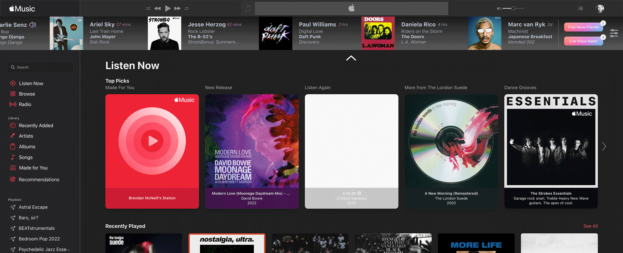
As seen above, the carousel would move automatically across the page, from left to right. It contains all applicable information such as the user's name, what they're listening to right now or when they were last active, and the name of the song, artist, and album/playlist/radio show.
A gradient is implemented for visual separation, and big, (but not too big), visuals to attract the user's attention + give them space to click on different components. It takes up less space than Spotify's version but utilizes it more effectively while giving the same information in a more stylized way. Aesthetically speaking, the social bar also seamlessly integrates with apple music's current interface- square, vertical grids.


Each component directs the user to a different place, this encourages exploration of the platforms artists, songs, playlists and albums.
Emphasis on the social experience of music
Because music is a social experience in the digital and physical space, as part of the social bar I designed a feature that indicated when the users liked/listened to artists who were going to be performing near them. Not just concerts, it could be a cover band, or a themed night at a club ex: Emo night at Sneaky Dee's. Any event that would be facilitating in-person connectedness based on a shared appreciation for the music, and perhaps not even in-person, such as a virtual show in the metaverse.

Nostalgia
Lastly, based on research I noticed there was a strong pull among users toward artists they had listened to in their younger years. Music is frighteningly effective at invoking a strong sense of nostalgia, taking us back to a point in time when that song or record was so relevant. In the live show radar, I included a section called 'Don't forget about these artists' for that very reason. These are artists that may not be in heavy rotation anymore, but hold a special place in the user's heart. Perhaps they, or someone they know, would like to see a live performance by an old favourite.

live music radar & nostalgia feature brainstorming
Social bar spread + details

Final Version
Focus 2 - Improving the accuracy and accessibility of finding new music
Next up was solving the problem of suggestions and recommendations that were falling short of the user's expectations. Once again, I designed a solution for Apple Music.
AI algorithms which are curating playlists and song/artist radios are only as good as the data they are receiving. There is a consistent stream of user data being given by users listening patterns, but this information is driven by what the users are already listening to. It isn't necessarily as effective as it could be in helping to find NEW music that users haven't listened to yet. Improvement in this area would be embraced with open arms. My research found that 97% of users see 'ease of finding new music' as a top desirable in a music streaming platform and as mentioned earlier, a commonly cited pain point is the AI falling short of making quality recommendations.
So I designed a 'recommendations' feature. This feature asks a series of brief questions, max 3, to update user preferences and give the AI more quality, up to date information to work with. Music is changing every day, and user's preferences are also prone to change, with more nuanced user input to work with, smarter and more personalized recommendations can be made. This will help the user streamline the process of finding something new they actually enjoy. Questions would be asked again every 3 or 4 months to update preferences.

above & below, brainstorming and research

Recommendations user flow
"Music is changing every day, and your preferences might be too."
"Who started you on your musical journey?"
"Comfortable where you are, or open to trying something new?
Rethinking the algorithm

Technology should foster open-mindedness and curiosity, not stifle it, after all, it wouldn't exist without these aforementioned traits. However, when it comes to most algorithms there is cognitive dissonance. Our content consumption is based on previous behaviour, we are being fed more of the same. A steady diet of comfortable content that in no way challenges us or facilitates growth in only one direction.
There is value in this method, it's easier for a user to find out about related content they wouldn't necessarily find otherwise, it retains attention, which translates to dollars and minimizes the risk of the user having an unfavorable or boring experience and leaving the platform. However, at its worst, it can perpetuate ignorance, a binary perception of a nuanced issue (or the world) and misinformation. Tristan Harris (the co-founder of the Center for Humane Technology) illustrates this consequence perfectly in his metaphor of users viewing a 'funhouse mirror' version of reality. A severely warped perspective of society, how it operates and its values.
So how does this relate to this question in the context of Apple Music?
"Are you interested in exploring new types of music?"
This question confronts the status quo of content recommendation & proposes a modification to its approach.
My research found that having a personalized experience and variety in content were areas where streaming platforms were falling short. By asking this question I'm assessing the user's openness to new experiences, prompting them to consider expanding their horizons at their own pace to find new music, a healthy and often very fulfilling experience. Depending on the response, from 'no' to 'absolutely', deviation from the user's current listening habits will be suggested accordingly. The explorative component will still be informed by the user's past listening history, suggesting tangential or distantly related content that the regular algorithmic system wouldn't normally suggest. Of course, if the user does not like the recommendation, that feedback is available to give in 'disliking' the track.
This question, along with the others in the improved recommendations survey, would craft a more informed and personalized approach to finding new content and if the user desires, help expand their musical horizons to truly utilize the 100 million song catalogue to its full potential for maximum value.
Color, typography, iconography & buttons


Retrospection, what did I learn?
-
Solutions always have room to evolve, just when I thought I had completed the design feature, I realized there was room for improvement. Small additions can be made that will bring the functionality to the next level - eg: the addition of 'Live show radar' + 'Dont forget about these artists'. I added these components after the social bar had been 'completed'. Retrospectively the product would seem incomplete and of much lesser value to the user without it.
-
Quality user data has so much to offer, it can be interpreted in alot of different ways. Multiple problems and multiple solutions can arise in the process. It's up to the designer to focus on those which are causing the biggest pain points and solutions which will best serve the user and start there.
-
Speaking of user research, I kept a constant eye on the research data collected, this kept me on track in the design process.
-
Lastly, I function best on a team. I worked on this project primarily solo, and although I am happy with the final results, I find the design process so much more fulfilling as a collaborative experience. Working with other creatives who have different experiences and perspectives is the best way to grow as an individual and a collective. This practice also ensures the best possible solutions are brought to fruition.
Designs evolve, what's next?
-
Usability testing for both features
-
Mobile optimization for both features
-
Conceptualize additional questions for the recommendations feature that will be asked in future sessions to derive effective/relevant data to assist AI. (ex: has the music selection of any of those you follow piqued your interest lately?' or 'are there any genres you wish to explore further?')
-
Improved recommendations integration with the 'Genius' feature. Genius, a feature that isn't particularly front-facing and seems to have become obsolete could pair well and possibly be revitalized by this integration.
-
Build on social bar information - ex: 'User 1 liked this track', 'user 2 is attending this event'
-
Accessibility improvements, make it easier for users to state whether they 'Love' or 'Dislike' a track, album, or playlist. As it currently stands you have to enter a submenu to do this, if it's easier to input this information, it supplies the algorithm with more valuable information to work with. Instead of multiple clicks to input this simple action, how about one key, for example, the 'L' key to love a track, and the 'D' key to dislike it? Alternatively, the left and right arrow keys, the left key to dislike, the right key to love, or up and down. User testing would be conducted to see which would be most intuitive.
-
Finalize & finesse interface design for 'light mode' on the social bar.